Pareto principle was introduced by Italian Economist Vilfredo Pareto. He stated that 80% of the effects are caused by 20% of the causes. So if we closely monitor and solve 20% of the causes. It will significantly improves the affected area and you will see good results.
For Example: 80% of the revenue gets generated by 20% of the clients
While doing research Mr. Pareto found that 20% of land in Italy was occupied by 80% of the population. He carried out this survey to other areas and got same results
This rule is also well known as 80/20 rule across the globe and is mostly being used to find the causes which is impacting business or producing defective products/services
Hence Pareto chart is a graphical representation of Pareto Principle
Pareto Chart studies the frequency distribution and advise you the most impacted/affected areas. So you should use Pareto Chart when:
Here are few steps to collect data before you start preparing your Pareto Chart in Excel:
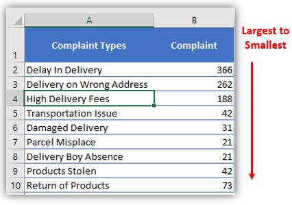
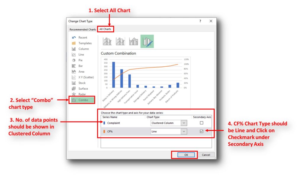
Here I collated the Complaints data from one of the Courier Company survey and will create Pareto Chart for them. Lets follow the steps now:
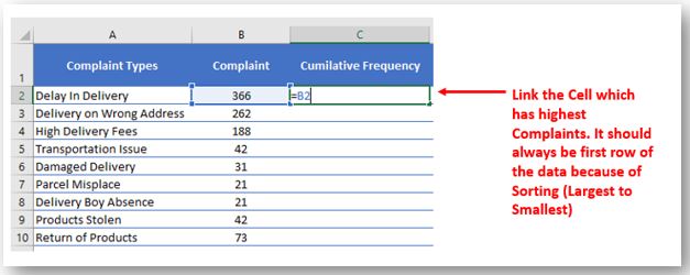
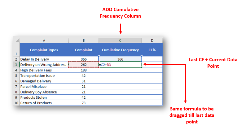
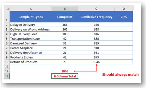
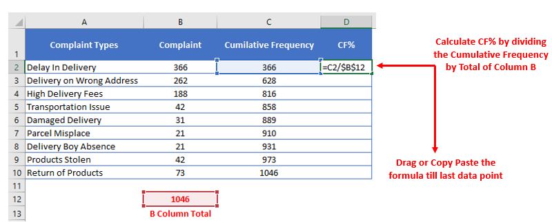
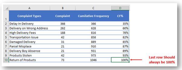
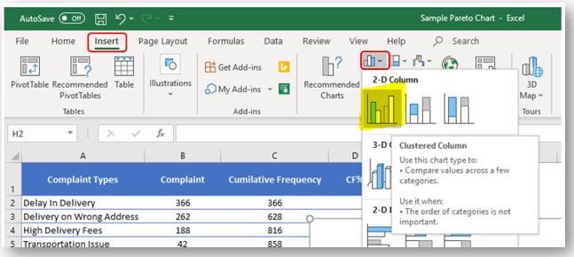
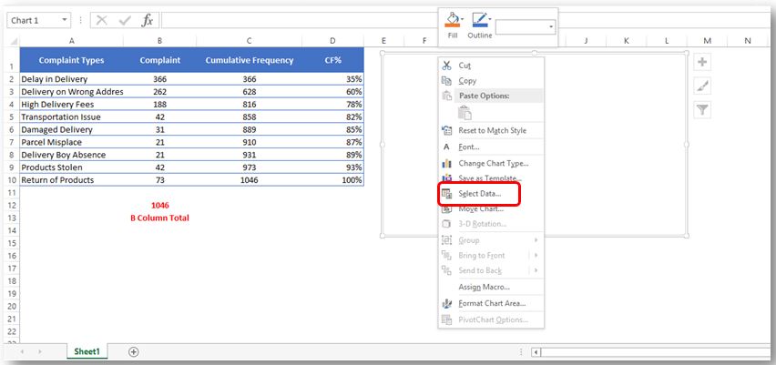
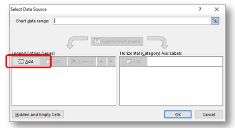
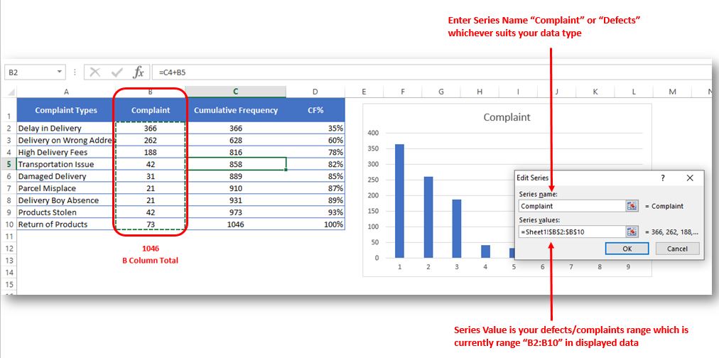
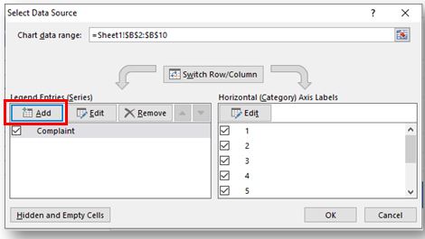
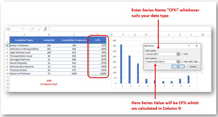
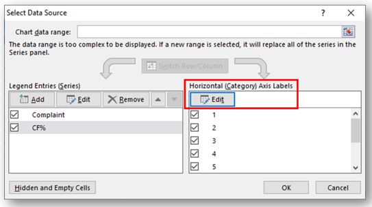
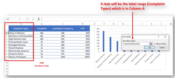
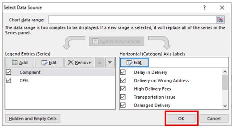
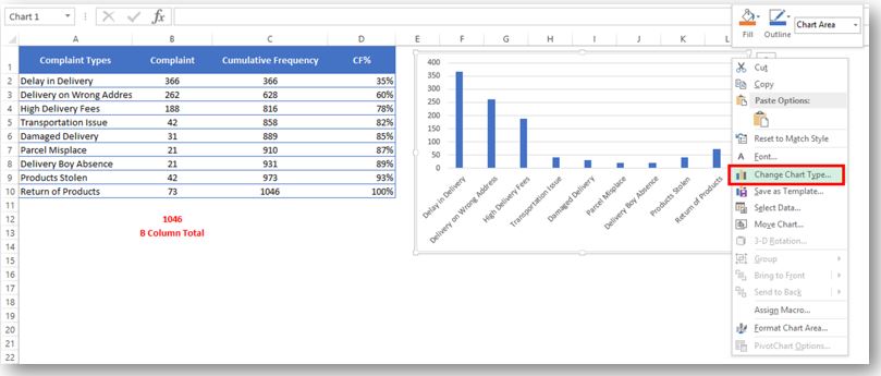
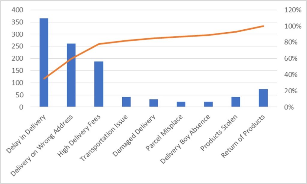
So here your Pareto chart is ready. This will help you to showcase the major pain areas or impacted areas in visual display
Now if you want to make this chart more appealing and visual. Then you can do this by learning tricks about formatting charts.
Hope you liked this article. Please comment below for any questions and for your feedback about this tutorial.
Follow us by Subscribe Us option for new updates

Blank rows in Excel can be a real hassle, making it harder to move around and work with your data. But don’t worry—there are plenty of easy ways to get rid of these unwanted rows….

You need to know how to insert and use the degree symbol in a cell.
Let me explain why this is important. Yesterday, I was working with temperature data, and it was crucial to use the degree symbol to indicate Celsius and Fahrenheit.

MIN function is used to get the smallest number in range or list of values.MIN function has one required i.e. number1 and optional argument i.e. [number2]

RANK function performs the Ranking in a range or list of numbers. Function returns the rank position and can assigned as highest or lowest value as 1st Rank

In this tutorial, learn how to merge columns using Power Query. Follow this step-by-step guide to convert data into a table, merge columns seamlessly, and customize separators. Whether you’re a beginner or an advanced user, this tutorial will enhance your data manipulation skills and streamline your workflow. Master Power Query and optimize your data management processes effortlessly.
Have you ever got into situation in office where you need to count the cells in Excel sheet with specific color? If yes then you can use following code which counts the number of cells…
I really liked this article. Well drafted. Thanks for the help 🙂