How to create timeline for Excel pivot tables and charts
This article will show you how to create a timeline for Excel PivotTables and charts, making it easy to explore your data in a fun and interactive way.
Imagine you have your data neatly arranged in a PivotTable and are eager to analyze it. But there’s a challenge – your data is spread over time. Maybe it’s monthly sales figures or project deadlines throughout the year. How can you track and understand it all without getting lost in numbers? The solution is simple: timelines!
Table of Contents
What is a timeline in Excel pivot tables and charts?
A timeline in an Excel PivotTable or PivotChart is a handy tool that helps you quickly filter data by time using a simple slider. If your pivot table or chart has dates in the rows or columns, you can use a timeline to filter by years, quarters, months, or days. Plus, you can change its look to match your workbook’s style!
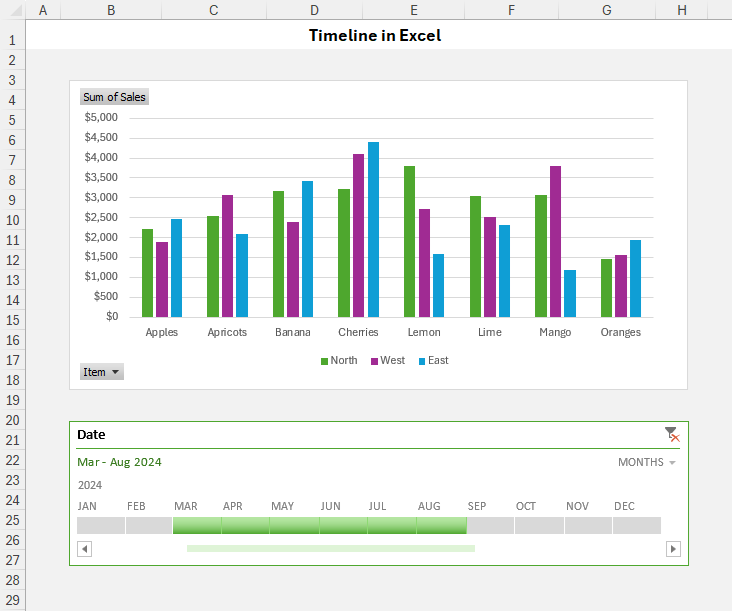
Imagine this: Your PivotTable or chart is ready, but instead of searching through long lists of dates or adjusting filters, you have a simple slider right in front of you. That’s your timeline! With just a few clicks, you can zoom in or out on specific time periods, making it easy to focus on the data that matters most. It’s fully dynamic—change the timeframe anytime, and your PivotTable or chart updates instantly!
How to create a timeline for Excel pivot table
Creating a PivotTable timeline in Excel is super quick and easy! Just follow these steps:
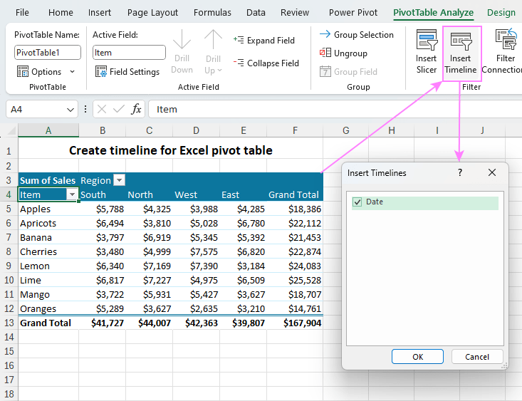
- Click anywhere inside your PivotTable to activate the menu.
- Go to the PivotTable Analyze tab and click Insert Timeline in the Filter group.
- A box will appear—select the date field you want to use.
- Click OK, and that’s it!
You’ve just added a timeline to your PivotTable. Now, you can quickly filter your data by years, months, or days and discover valuable insights with ease!
How to make a timeline for Excel pivot chart
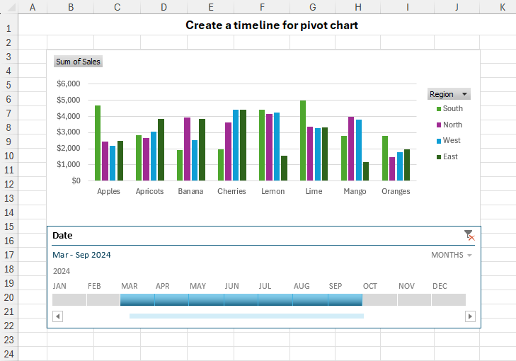
When you create a timeline for an Excel PivotTable, it automatically links to all PivotCharts based on that table. If you want to add the timeline inside the PivotChart area, follow these simple steps:
- Click on your PivotChart to select it.
- Go to the PivotChart Analyze tab and click Insert Timeline.
- Choose the date field you want and click OK—this adds the timeline to your worksheet.
- Adjust the chart size by dragging the edges. You can make the chart area bigger and the plot area smaller to fit the timeline.
- Drag the timeline into the empty space at the bottom of your chart.
Now, your timeline is part of the chart, making it even easier to filter data by time!
How to use a timeline in Excel
Once your timeline is set up, you can easily filter your PivotTable and chart by time. Here’s how:
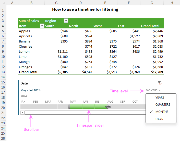
- Choose a time level – Use the Time Level dropdown to pick how you want to view the data: years, quarters, months, or days.
- Select a time period – Move the slider to choose your time range. Click a tile to select one period, or drag the handles to pick multiple days, months, quarters, or years.
- Scroll through time – Use the scrollbar to move through different time periods quickly.
This makes it super easy to focus on the exact data you need!
How to customize Excel timeline
To make your data analysis even better, you have the flexibility to fine-tune the default timeline created by Excel. By changing its appearance, position, and size, you can get the dynamic filter to perfectly complement your pivot table or chart.
Move a timeline
To move the timeline to a better spot, just drag it like any other object in Excel:
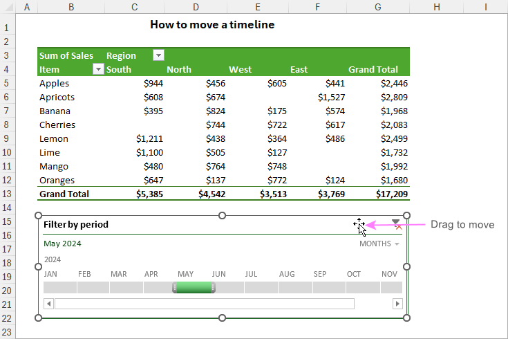
- Place your mouse pointer over the top part of the timeline until you see a four-pointed arrow (this means it’s ready to move).
- Click, hold, and drag the timeline to wherever you want it on the sheet.
That’s it! You can easily place it in the perfect position.
Resize a timeline
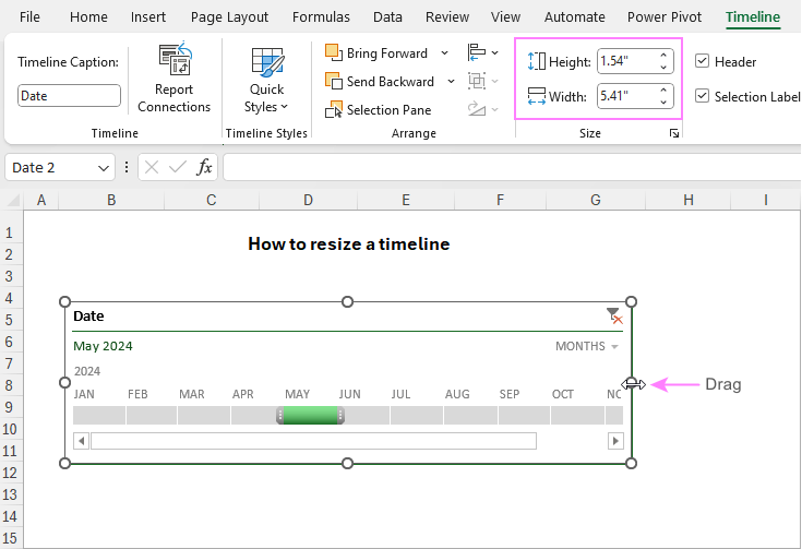
To resize the timeline quickly, just click it and drag the edges to make it bigger or smaller.
For a more precise size:
- Click on the timeline to select it.
- Go to the Timeline tab and find the Size group.
- Enter the exact height and width in the boxes.
Now your timeline will fit perfectly in your worksheet!
Change timeline style
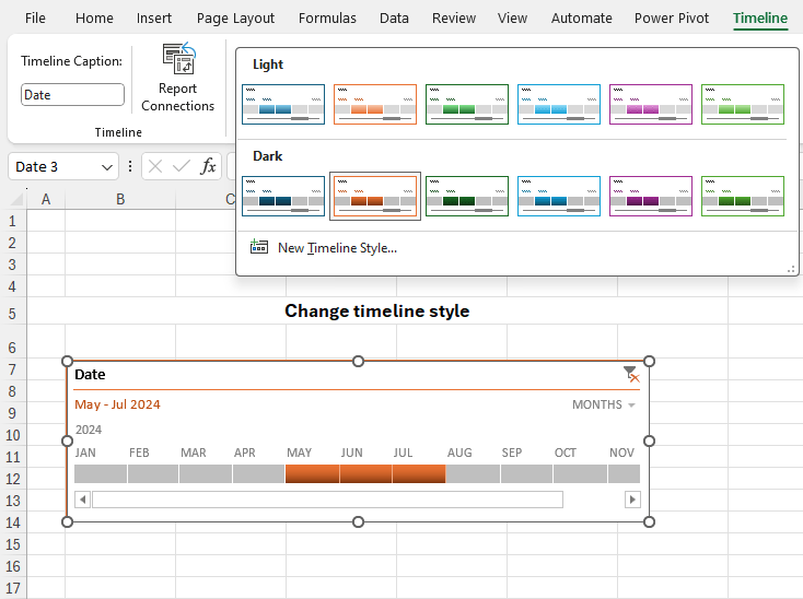
You can customize your timeline to match your presentation by changing its style. Excel offers 12 ready-made styles, or you can create your own for a unique look.
To change the timeline style:
- Click on the timeline to activate the menu.
- Go to the Timeline tab and choose a style from the Timeline Styles gallery.
- Want something unique? Click New Timeline Style to design your own.
These options let you personalize your timeline, making it more visually appealing and easier to analyze!
Change timeline caption
By default, an Excel timeline takes its name from the date column it’s linked to. But you can rename it anytime with these simple steps:
- Click on the timeline to select it.
- Go to the Timeline tab at the top.
- In the Timeline Caption box, type the new name you want.
- Press Enter to save the change.
This way, you can give your timeline a clear and meaningful name that fits your data!

Hide or show the selection label
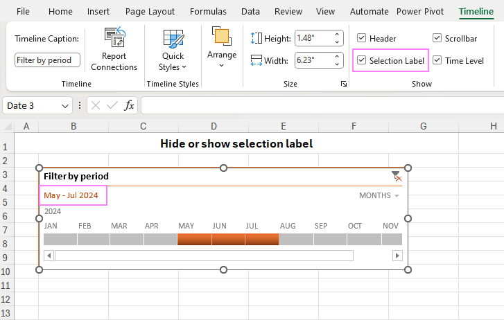
By default, the filtered date range appears in the top-left corner of the timeline. You can choose to show or hide it easily:
- Click on the timeline to select it.
- Go to the Timeline tab at the top.
- In the Show group, find the Selection Label option.
- Uncheck the box to hide the date range or check it again to show it.
This lets you control whether the date filter is visible or hidden!
How to lock the timeline position in a sheet
To keep your timeline in place and stop it from moving when you change your sheet, follow these simple steps:
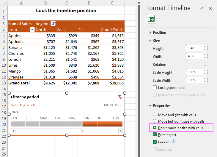
- Right-click on the timeline and choose Size and Properties…
- In the Format Timeline pane, go to the Properties section.
- Check the option “Don’t move or size with cells.”
Now, your timeline will stay fixed even if you add or delete rows, adjust PivotTable fields, or make other changes!
How to connect a timeline to multiple pivot tables
If you have multiple PivotTables using the same data, you can use one timeline to filter them all at once! Here’s how to link a timeline to multiple PivotTables:
- Click on the timeline to select it.
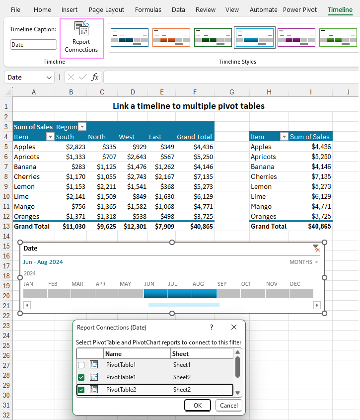
- Go to the Timeline tab and click Report Connections (or right-click the timeline and choose Report Connections).
- In the Report Connections window, check the PivotTables you want to filter.
- To disconnect a table, simply uncheck its box.
Now, your timeline will control multiple PivotTables at the same time, making data analysis even easier!
How to clear timeline filter
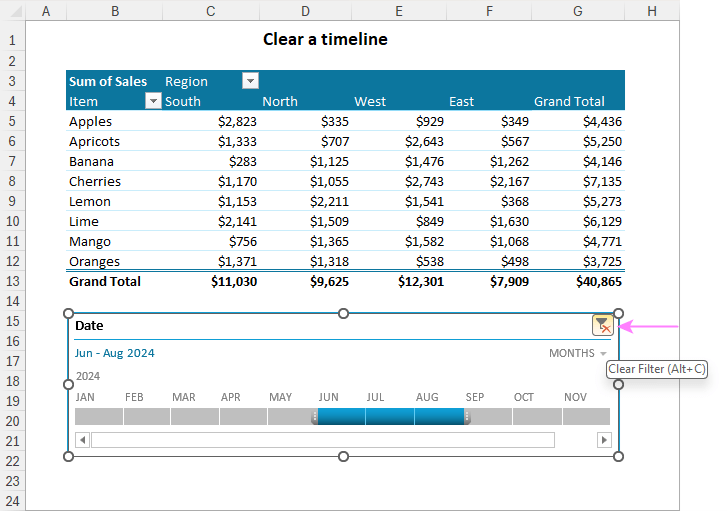
To clear a timeline, click the Clear Filter button or press the Alt + C shortcut. This will remove all applied filters and reset the timeline, allowing for a fresh analysis of the data.
How to remove a timeline
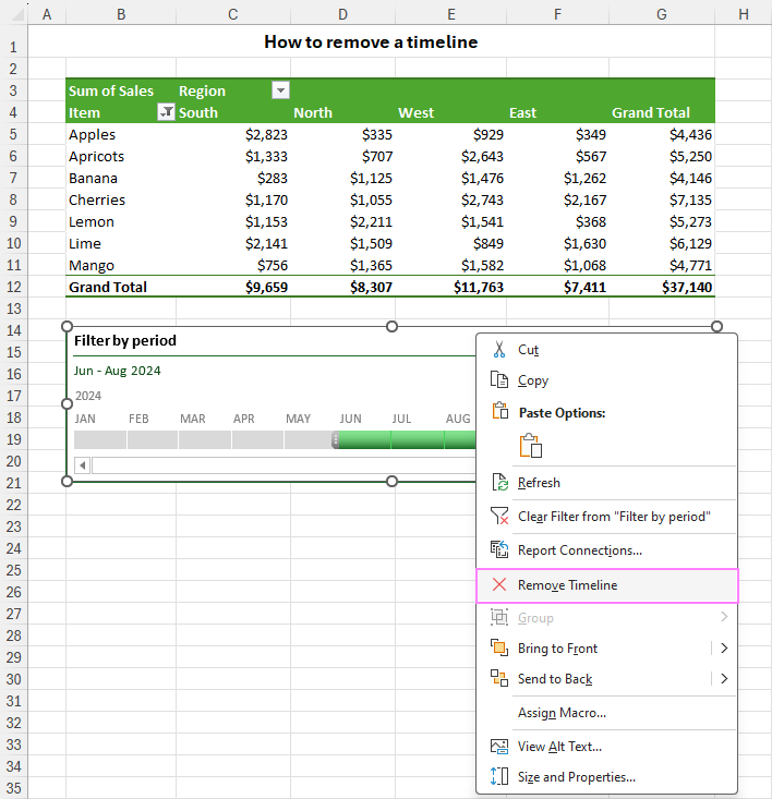
If you no longer need the timeline, you can remove it easily in two ways:
- Right-click the timeline and choose Remove Timeline.
- Click on the timeline and press the Delete key on your keyboard.
That’s it! The timeline will disappear, so you can focus on other parts of your analysis
Excel pivot table timeline not working
Having trouble adding a timeline to your PivotTable or PivotChart in Excel? You might see an error message like:
“We can’t create a Timeline for this report because it doesn’t have a field formatted as Date.”
This can happen even if your data has a date column—but don’t worry, there’s a fix!

A PivotTable timeline might not work for two main reasons:
- Your data source doesn’t have a date column at all.
- Your dataset does have a date column, but the dates are actually text instead of real date values.
To fix this, make sure your data includes actual dates, not just text that looks like dates!
To solve this issue, you need to:
- Add a real date column if your data doesn’t have one.
- Convert text dates into actual dates if your dates are stored as text.
I’ll share easy ways to tell the difference between real dates and text-dates, plus quick fixes to convert them!
timelines in PivotTables and PivotCharts make data analysis easier and more powerful. With just a few clicks, they turn static numbers into dynamic insights, helping you analyze trends and make smarter decisions—fast!
So go ahead—try it out, explore, and watch your data come to life!


