When I started my career in working with excel dashboards, I always used to face most common challenge in “Data Validation” technique where I want a smart data validation to avoid all blank cells and keep adding and deleting the values from drop down dynamically.
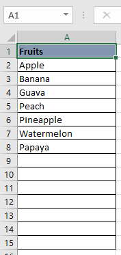
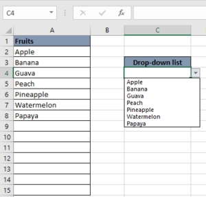
Step 1: Identify the range which you want to show into data validation list. Here I selected a range from A2:A15. Refer the below screenshot:

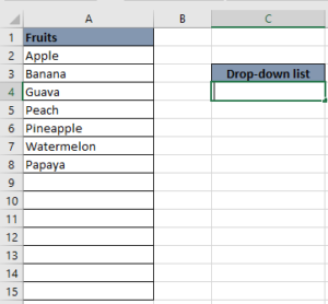
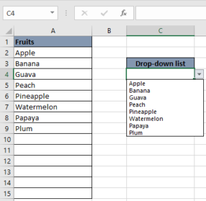
Step 5: Here is your Validation list 
Hope you enjoyed this article. See you soon again with a new article