How to Create a heat map in Excel with or without numbers
Excel has built-in options to make graphs, it doesn’t have a heat map feature. However, you can quickly and easily create a heat map in Excel using conditional formatting.
Table of Contents
What is heat map in Excel?
A heat map is a visual tool that displays data using colors. Higher values are often shown with warmer colors like red, while lower values are shown with cooler colors like blue. This color-coding makes it easier to see patterns in the data at a glance, instead of trying to interpret numbers in a regular table or report.
Heat maps are commonly used by scientists, analysts, and marketers to quickly analyze data and identify trends. For example, they might use a heat map to see which areas of a website are getting the most clicks or to track temperature changes in different regions over time
Some common examples include:
- Air temperature heat map: A map that shows the air temperature in a specific region using colors.
- Geographical heat map: A map that uses different shades to show numbers across a geographic area.
- Risk management heat map: A visual tool that clearly shows different risks and their impacts using colors.
In Excel, a heat map shows individual cells in different colors based on their values.
Lorem ipsum dolor sit amet, consectetur adipiscing elit. Ut elit tellus, luctus nec ullamcorper mattis, pulvinar dapibus leo.
How to create a heat map in Excel
If you were considering coloring each cell based on its value manually, it’s better to drop that idea. Doing it by hand would be a huge waste of time. It would be hard to pick the right color for each value, and you’d have to redo all the colors every time the values change. Thankfully, Excel’s conditional formatting can do this automatically, saving you time and effort.
To make a heat map in Excel, we will be using conditional formatting color scale. Here are the steps to perform:
- Select your dataset. In our case, it’s B3:M5.

On the Home tab, in the Styles group, click Conditional Formatting > Color Scales, and then click the color scale you want. As you hover the mouse over a particular color scale, Excel will show you the live preview directly in your data set.
For this example, we’ve chosen Red – Yellow – Green color scale:
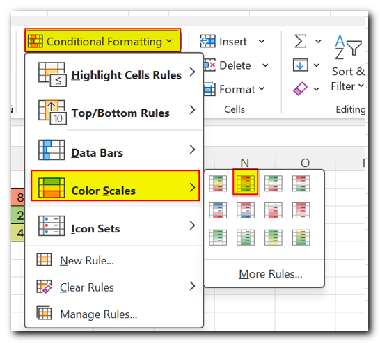
In the result, you will have the high values highlighted in red, middle in yellow, and low in green. The colors will adjust automatically when the cell values change.

Make a heatmap with a custom color scale
When you use a preset color scale in Excel, it shows the lowest, middle, and highest values in specific colors (like green, yellow, and red). The other values get different shades of these main colors.
If you want to highlight all cells below or above a certain number with the same color, no matter what their exact values are, you’ll need to create your own color scale instead of using the built-in one. Here’s how you can do it
On the Home tab, in the Styles group, click Conditional Formatting > Color Scales > More Rules.
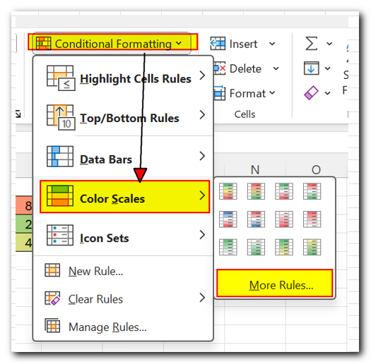
In the New Formatting Rule dialog box, follow these steps:
- Choose ‘3-Color Scale’ from the Format Style drop-down list.
- For the Minimum and/or Maximum values, select ‘Number’ from the Type drop-down and enter your desired values in the boxes.
- For the Midpoint, you can choose either ‘Number’ or ‘Percentile’ (usually 50%).
- Assign a color to each of the three values.
For this example, we’ve set it up with the following settings
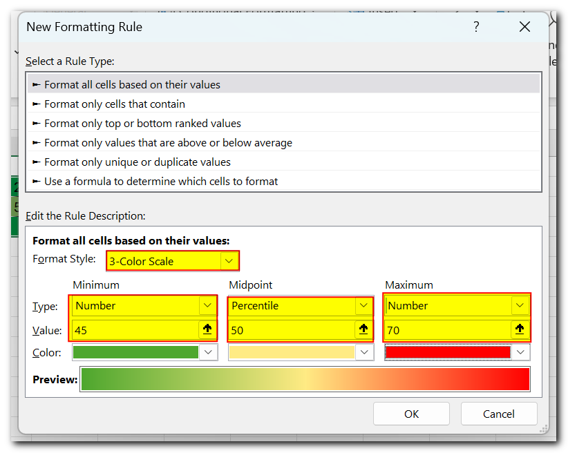
In this custom heatmap, all the temperatures below 35 °F are highlighted in the same shade of green and all the temperatures above 65 °F in the same shade of red:

Create a heat map in Excel without numbers
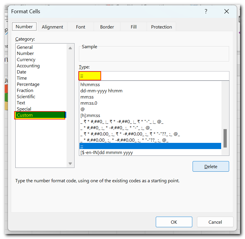
The heat map in Excel is created using the actual cell values, so if you delete them, the heat map will be lost. To hide the cell values without deleting them, you can use custom number formatting. Follow these steps:
- Select the heat map.
- Press Ctrl + 1 to open the Format Cells dialog box.
- Go to the Number tab, and under Category, select Custom.
- In the Type box, type three semicolons (;;;).
- Click OK to apply the custom format.
That’s it! Now, your Excel heat map displays only the color-codes without numbers:

Excel heat map with square cells
You can improve your heatmap by making the cells perfectly square. Here’s the quickest way to do it without using scripts or VBA:
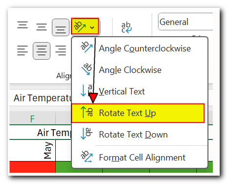
Turn your column headers vertical. To avoid cutting off the text in the headers, change their alignment to vertical. You can do this easily with the Orientation button in the Alignment group on the Home tab

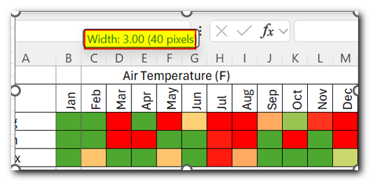
Adjust the column width. Select all the columns and drag the edge of any column header to make it wider or narrower. A small box will show the exact pixel count as you adjust—just remember this number.
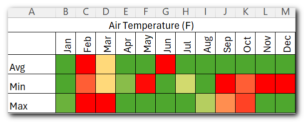
Set row height. Select all the rows and drag any row header’s edge to the same pixel value as columns (26 pixels in our case).

Done! All the cells of your hat map are now square shaped:
How to create a dynamic heat map in Excel with checkbox
If you want the heatmap to show only when needed, you can use a checkbox to hide or display it. Here’s a simple way to create a dynamic heatmap with a checkbox:
- Insert a checkbox: Place a checkbox next to your data. To do this, go to the “Developer” tab, click “Insert,” choose “Form Controls,” and select “Checkbox.”
- Link the checkbox to a cell: Right-click the checkbox, choose “Format Control,” go to the “Control” tab, enter a cell address in the “Cell link” box, and click “OK.”
For example, if the checkbox is linked to cell O2, when you check the box, O2 will show “TRUE”; if unchecked, it will show “FALSE”.

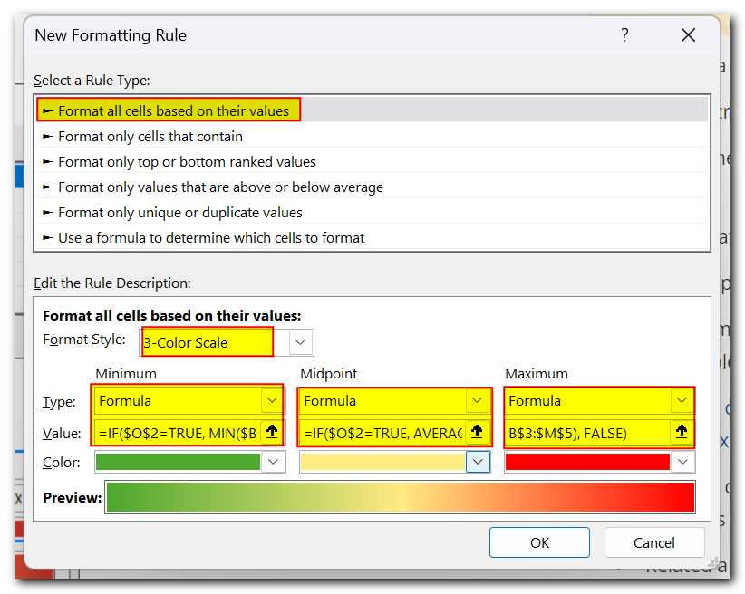
- Set up conditional formatting. Select the dataset, click Conditional Formatting > Color Scales > More Rules, and configure a Custom Color scale in this way:
- In the Format Style drop-down list, select 3-Color Scale.
- Under Minimum, Midpoint and Maximum, select Formula from the Type drop-down list.
In the Value boxes, enter the following formulas
=IF($O$2=TRUE, AVERAGE($B$3:$M$5), FALSE)
These formulas use the Min Max and average Functions to work out the lowest, middle and highest values in the dataset (B3:M5) when the linked cell (O2) is TRUE, i.e. when the checkbox is selected.
- In the Color drop-down boxes, choose the desired colors.
- Click the OK button.
Now, the heat map appears only when the checkbox is selected and is hidden the rest of the time.

How to make a dynamic heat map in Excel without numbers
To hide numbers in a dynamic heatmap, you can add an extra conditional formatting rule using a custom number format. Here’s how:
- First, create the dynamic heatmap as explained earlier.
- Next, select your data.
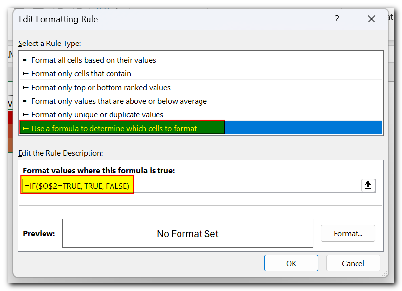
- Go to the “Home” tab, click “New Rule” in the “Styles” group, and choose “Use a formula to determine which cells to format.”
- In the box labeled “Format values where this formula is true,” enter this formula.
Where O2 is your linked cell. The formula says to apply the rule only when the checkbox is checked (O2 is TRUE).
Click the Format… button.
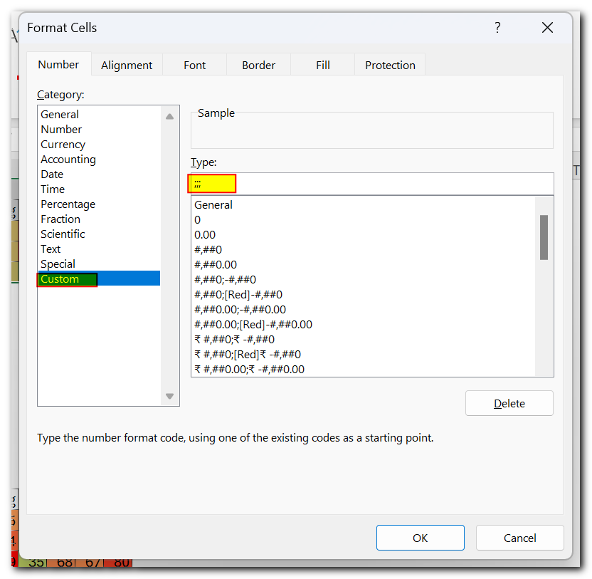
In the Format Cells dialog box, switch to the Number tab, select Custom in the Category list, type 3 semicolons (;;;) in the Type box, and click OK.
Click OK to close the New Formatting Rule dialog box.
From now on, selecting the check box will display the heat map and hide numbers:

To see how this works, feel free to download our sample sheet. This should help you create your own great Excel heatmap template.
Thank you for reading, and I hope to see you on our blog next week!
 New Excel VBA Course Live Now! $49 for first 100 Students Only

