Correlation in Excel: coefficient, matrix and graph
This tutorial teaches the basics of correlation in Excel. It shows how to find a correlation coefficient, make a correlation matrix, and understand the results.
Correlation is one of the easiest calculations you can do in Excel. Even though it’s easy, it helps a lot in understanding how two or more things are related. Excel has all the tools you need to do a correlation analysis—you just need to know how to use them
Table of Contents
Correlation in Excel - the basics
Correlation measures how strong and in what direction two things are related. It’s often used in fields like statistics, economics, and social sciences, such as for budgets or business plans.
The process of studying how closely things are related is called correlation analysis.
Here are examples of strong correlations:
- The more calories you eat, the more weight you gain (positive correlation)
- The warmer it is outside, the less you spend on heating (negative correlation)
Examples of weak or no correlation:
- Your cat’s name and its favorite food
- Your eye color and your height
It’s important to know that correlation only shows how closely two things are related. It doesn’t mean one thing causes the other to change. If you want to understand cause and effect and make predictions, you should look into linear regression analysis.
Correlation coefficient in Excel - interpretation of correlation
The correlation coefficient (r) is a number that shows how strongly two continuous things are related.
The value of the coefficient is always between -1 and 1. It tells us both the strength and the direction of the relationship between the two things.
Strength
The closer the correlation coefficient is to -1 or 1, the stronger the relationship:
- A value of -1 or 1 means a perfect relationship, where all the data points fall exactly on a line. But in real life, perfect correlations are rare.
- A value of 0 means no relationship between the two things, like when you compare two sets of random numbers.
- Numbers between 0 and +1 or -1 show weak, moderate, or strong relationships. The closer the number is to -1 or 1, the stronger the relationship.
Direction
The sign of the coefficient (plus or minus) shows the direction of the relationship:
- A positive coefficient means the two things move in the same direction, and the graph slopes upwards. As one thing increases, so does the other.
- A negative coefficient means the two things move in opposite directions, and the graph slopes downwards. As one thing increases, the other decreases.
For better understanding, look at these examples:
- A coefficient of 1 means a perfect positive relationship—when one thing increases, the other increases at the same rate.
- A coefficient of -1 means a perfect negative relationship—when one thing increases, the other decreases at the same rate.
- A coefficient of 0 means there’s no relationship between the two things—the data points are scattered randomly on the graph.

Pearson correlation
In statistics, there are different types of correlation based on the type of data you have. In this tutorial, we will focus on the most common one.
Pearson Correlation (also called Pearson Product Moment Correlation or PPMC) is used to check if two things are related in a straight line. It helps us understand if a change in one thing is matched by a proportional change in another. Simply put, Pearson Correlation answers the question: Can we show the data on a straight line?
It is the most popular type of correlation in statistics. If someone mentions a “correlation coefficient” without saying which type, they are usually talking about Pearson.
Here’s the most common formula to find the Pearson correlation coefficient, also known as Pearson’s R:

Sometimes, you might see two other formulas: one for calculating the sample correlation coefficient (r) and one for the population correlation coefficient (ρ).
How to do Pearson correlation in Excel
Calculating the Pearson correlation coefficient by hand involves a lot of math. Thankfully, Microsoft Excel makes it easy. Depending on your data and what you want to do, you can use one of these methods:
- Use the CORREL function to find the Pearson correlation coefficient.
- Create a correlation matrix using Data Analysis.
- Find multiple correlation coefficients with a formula.
- Make a correlation graph to see a visual representation of how the data is related.
How to calculate correlation coefficient in Excel
To calculate a correlation coefficient by hand, you’d need to use a long formula. But in Excel, you can use the CORREL or PEARSON function and get the result in just a second.
Excel CORREL function
The CORREL function returns the Pearson correlation coefficient for two sets of values. Its syntax is very easy and straightforward:
CORREL(array1, array2)
Where:
- Array1 is the first range of values.
- Array2 is the second range of values.
The two arrays should have equal length.
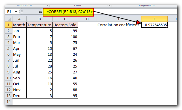
Assuming we have a set of independent variables (x) in B2:B13 and dependent variables (y) in C2:C13, our correlation coefficient formula goes as follows:
=CORREL(B2:B13, C2:C13)
Or, we could swap the ranges and still get the same result:
=CORREL(C2:C13, B2:B13)
Either way, the formula shows a strong negative correlation (about -0.97) between the average monthly temperature and the number of heaters sold:
3 things you should know about the CORREL function in Excel
To calculate the correlation coefficient in Excel, remember these 3 simple points:
- If any cell in your data contains text, TRUE/FALSE values, or is empty, Excel will skip those cells. Cells with a zero are included in the calculation.
- If the two data sets you are comparing have different numbers of cells, Excel will show an #N/A error.
- If one of the data sets is empty or the values in either set don’t vary (meaning all the values are the same), Excel will show a #DIV/0! error.
Excel PEARSON function
The PEARSON function in Excel does the same thing – calculates the Pearson Product Moment Correlation coefficient.
PEARSON(array1, array2)
Where:
- Array1 is a range of independent values.
- Array2 is a range of dependent values.
Because PEARSON and CORREL both compute the Pearson linear correlation coefficient, their results should agree, and they generally do in recent versions of Excel 2007 through Excel 2019.
In Excel 2003 and earlier versions, however, the PEARSON function may display some rounding errors. Therefore, in older versions, it is recommended to use CORREL in preference to PEARSON.
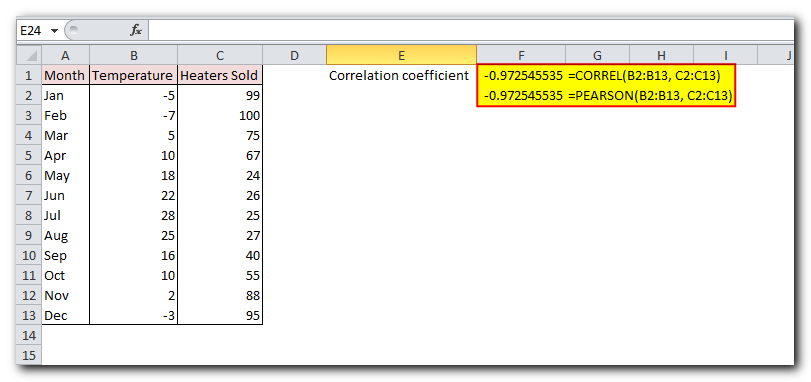
On our sample data set, both functions exhibit the same results:
=CORREL(B2:B13, C2:C13)
=PEARSON(B2:B13, C2:C13)
How to make a correlation matrix in Excel with Data Analysis
When you need to test interrelations between more than two variables, it makes sense to construct a correlation matrix, which is sometimes called multiple correlation coefficient.
A correlation matrix is a table that displays how strongly different variables are related to each other. The relationships are shown where the rows and columns meet.
You can create a correlation matrix in Excel using the Correlation tool, which is part of the Analysis ToolPak add-in. This tool is available in all Excel versions from 2003 to 2019, but it isn’t turned on by default. If you haven’t enabled it yet, follow the steps in the guide on how to turn on the Data Analysis ToolPak in Excel.
With the Data Analysis tools added to your Excel ribbon, you are prepared to run correlation analysis:
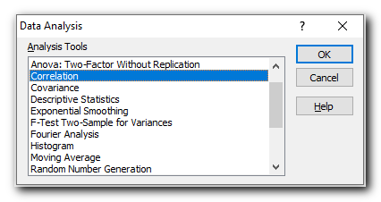
- On the top right corner of the Datatab > Analysis group, click the Data Analysis

2. In the Data Analysisdialog box, select Correlation and click OK.
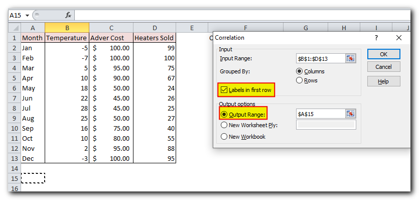
- In the Correlationbox, configure the parameters in this way:
Follow these steps to set up your correlation matrix:
- Click in the Input Range box and select the data range you want to analyze, including the column headers (in this example, B1;D13).
- In the Grouped by section, make sure the Columns option is selected (since your data is organized in columns).
- Check the Labels in first row box if your data range includes headers.
- Choose where you want to see the result. To show the matrix on the same sheet, select Output Range and enter the reference for the first cell where you want the matrix to start (in this case, A15).
- When you’re done, click OK.
Your matrix of correlation coefficients is done and should look something like shown in the next section.
Interpreting correlation analysis results
In your Excel correlation matrix, the numbers at the intersection of rows and columns show the correlation between variables. If the row and column are the same, the value will always be 1.
In the example above, we want to see how the dependent variable (number of heaters sold) relates to two independent variables (average monthly temperature and advertising costs). So, we focus on the numbers where these rows and columns meet, which are highlighted in the screenshot below
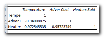
The negative coefficient of -0.97 (rounded to 2 decimal places) shows a strong reverse relationship between temperature and heater sales – as the temperature goes up, fewer heaters are sold.
The positive coefficient of 0.97 (rounded to 2 decimal places) shows a strong direct relationship between advertising and sales – the more money spent on ads, the more heaters are sold.
How to do multiple correlation analysis in Excel with formulas
Creating a correlation table using the Data Analysis tool is simple, but the table is fixed. This means you’ll need to run the analysis again whenever your data changes.
The good news is that you can easily create a similar table yourself, and it will automatically update whenever the source data changes.
To do this, use this basic formula:
CORREL(OFFSET(first_variable_range, 0, ROWS($1:1)-1), OFFSET(first_variable_range, 0, COLUMNS($A:A)-1))
Important note! For the formula to work, you should lock the first variable range by using absolute cell references.
In our case, the first variable range is $B$2:$B$13 (please notice the $ sign that locks the reference), and our correlation formula takes this shape:
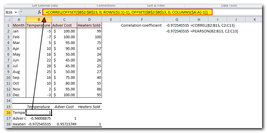
=CORREL(OFFSET($B$2:$B$13, 0, ROWS($1:1)-1), OFFSET($B$2:$B$13, 0, COLUMNS($A:A)-1))
Now, let’s create a correlation matrix using the formula:
- In the first row and first column of the matrix, type the labels for your variables in the same order as they appear in your data table (see the screenshot below).
- Enter the formula in the first cell of the matrix (B16 in this example).
- Drag the formula down and across to fill in the rows and columns (3 rows and 3 columns in this example).
- As a result, you will have a matrix showing several correlation coefficients. Notice that the values from our formula match exactly with the ones Excel gave in the previous example (the important ones are highlighted).
How this formula works
As you know, the Excel CORREL function gives you the correlation coefficient between two sets of data. The tricky part is making sure you put the right data ranges into each cell of the matrix.
To do this, you only need to enter the range for the first variable in the formula. Then, use the following functions to adjust it for the other variables:
OFFSET – gives you a range of cells that is a certain number of rows and columns away from a starting range.
ROWS and COLUMNS – these return the number of rows or columns in a range. In our correlation formula, both are used to calculate how many columns to move from the starting range. This is done by using a mix of absolute and relative cell references.
To understand how this works, let’s look at how the formula calculates the highlighted coefficients in the screenshot.
For example, the formula in cell B18 finds the correlation between the monthly temperature (B2) and heaters sold (D2):
=CORREL(OFFSET($B$2:$B$13, 0, ROWS($1:3)-1), OFFSET($B$2:$B$13, 0, COLUMNS($A:A)-1))
In the first OFFSET function, ROWS($1:1) changes to ROWS($1:3) because the row reference is relative, meaning it updates when you copy the formula down (in this case, 2 rows down). ROWS() returns 3, and after subtracting 1, the function shifts 2 columns to the right of the starting range, giving us $D$2:$D$13 (heater sales).
The second OFFSET doesn’t change the original range $B$2:$B$13 (temperature), because COLUMNS($A)-1 returns 0, meaning no shift.
So, the long formula simplifies to CORREL($D$2:$D$13, $B$2:$B$13) and gives us the correct correlation coefficient.
The formula in C18 calculates the correlation between advertising costs (C2) and sales (D2) in a similar way:
=CORREL(OFFSET($B$2:$B$13, 0, ROWS($1:3)-1), OFFSET($B$2:$B$13, 0, COLUMNS($A:B)-1))
The first OFFSET works the same as before, giving the range $D$2:$D$13 (heater sales).
In the second OFFSET, COLUMNS($A)-1 changes to COLUMNS($A)-1 because the formula was copied 1 column to the right. Now, the function shifts 1 column to the right, giving us $C$2:$C$13 (advertising costs).
How to plot a correlation graph in Excel
The best way to see the relationship between your data when doing correlation in Excel is by creating a scatter plot with a trendline. Here’s how:
- Select two columns of numeric data, including the headers. The order matters: the independent variable should be in the left column (for the x-axis), and the dependent variable should be in the right column (for the y-axis).
- Go to the Insert tab and, in the Charts group, click the Scatter chart icon. This will create an XY scatter plot in your worksheet.
- Right-click any data point on the chart and choose Add Trendline… from the menu.
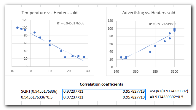
For our sample data set, the correlation graphs look like the one shown in the image below. We also included the R-squared value, known as the Coefficient of Determination. This value shows how well the trendline matches the data – the closer R² is to 1, the better the fit.
From the R² value on your scatter plot, you can easily find the correlation coefficient:
- Click on the R² value in the chart, select it with your mouse, and press Ctrl + C to copy it.
- Find the square root of R² using the SQRT function or by raising the copied R² value to the power of 0.5.
- For example, the R² value in the second graph is 0.9174339392. You can find the correlation coefficient for Advertising and Heaters sold using one of these formulas:
For example, the R2 value in the second graph is 0.9174339392. So, you can find the correlation coefficient for Advertising and Heaters sold with one of these formulas:
=SQRT(0.9174339392)
=0.9174339392^0.5
As you can make sure, the coefficients calculated in this way are perfectly in line with the correlation coefficients found in the previous examples, except the sign:
Potential problems with correlation in Excel
The Pearson Product Moment Correlation only shows a linear relationship between two variables. This means that even if your variables are strongly related in a different, curvy way, the correlation coefficient could be close to zero.
The Pearson correlation doesn’t differentiate between dependent and independent variables. For example, when we used the CORREL function to find the relationship between average monthly temperature and the number of heaters sold, we got a coefficient of -0.97, showing a strong negative correlation. However, if you swap the variables, you would still get the same result. This could lead someone to mistakenly think that higher heater sales cause temperatures to drop, which doesn’t make sense. So, when doing correlation analysis in Excel, be careful about the data you use.
Additionally, the Pearson correlation is very sensitive to outliers. If you have one or more data points that are very different from the others, it can give you a misleading view of the relationship between the variables. In such cases, it’s better to use the Spearman rank correlation instead.
That’s how to do correlation in Excel. To have a closer look at the examples discussed in this tutorial, you are welcome to download our sample workbook below. I thank you for reading and hope to see you on our blog next week!


