There are many ways to format your existing database in Microsoft Excel, and Conditional Formatting is the most common feature that is used to format and present the data in very effective and interactive manner.
Conditional Formatting option is available in Menu -> Home section and provide various of conditions from which we can format the database. It comes with variety of parameters, like we can highlight the cell with conditions of, Greater than, less than, Between, Equal to, Text that contains and so on. We can also highlight the cells with conditions of, Top/Bottom 10% etc.
Conditional formatting helps to create such types of visualization:
– Performance Report
– Attendance Tracker
– Grade/ Rating visualization
– Highest or Lowest values, Top or Bottom % report
– Sales summary
– Monthly expenditure summary
Conditional Formatting comes with limitation that, since formatting or visualizations are prepared based on the existing database, sometimes it may lead to incorrect presentation if database is not accurate. So always keep in mind that database is accurate before preparing presentations.
Kinds of Conditional Formatting:
There are variety of types of Conditional formatting like, formatting basis on
-> Highlight Cells by Rules:
-> Top/Bottom Rules
-> Data Bars
-> Color Scales
-> Icon Sets
We will cover all of the above types in each of examples. Keep reading the Conditional Formatting lesson:
– Greater Than…
– Less Than…
– Between…
– Equal To…
– Text that Contains…
– A Date Occurring…
– Duplicate Values…
We will start with below example:
-> Highlight Cells by Rules -> Greater Than…
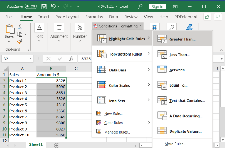
We have list of total 10 products and would need to highlight the products for which sales are greater than $8000. Follow the below steps:
Select the Sales values in Column B (in below example)
Click to Menu -> Conditional Formatting -> Highlight Cells by Rules ->Greater Than…
Input the values as per your requirement, 8000 as per the example. We can also change the colors to highlight, it is “Light Red Fill with Dark Red Text” as per the example
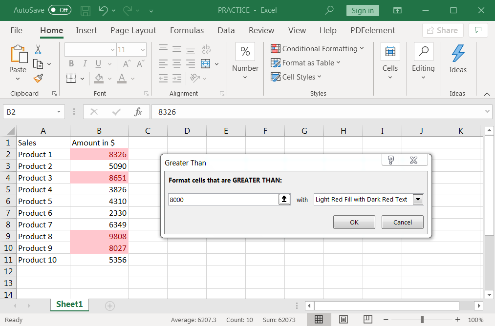
Click to “OK”
All the products greater than sales values 8000 will be highlighted in “Light Red Fill with Dark Red Text”
We can simply use the above steps to make the conditional formatting to below remaining parameters:
-> Highlight Cells by Rules:
– Less Than…
– Between…
– Equal To…
– Text that Contains…
– A Date Occurring…
– Duplicate Values…
We can also place conditional formatting basis on Top/Bottom Rules as follows:
-> Top/Bottom Rules
– Top 10 Items…
– Top 10%…
– Bottom 10 Items…
– Bottom 10 %…
– Above Average…
– Below Average…
We will start with -> Top/Bottom Rules -> Top 10 Items…
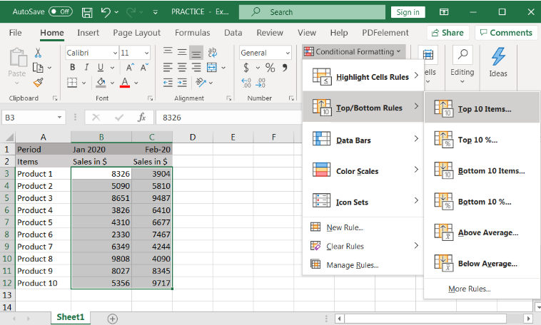
We have sales volumes for two period and now we want to highlight the Top 10 items in the total database. Follow below steps:
Select the Sales values in Column B and C (in below example)
Click to Menu -> Conditional Formatting -> Top/Bottom Rules -> Top 10 Items…
Input the values as per your requirement, i.e. 10 (for Top 10) as per the example. We can also change the colors to highlight, it is “Light Red Fill with Dark Red Text” as per the example:
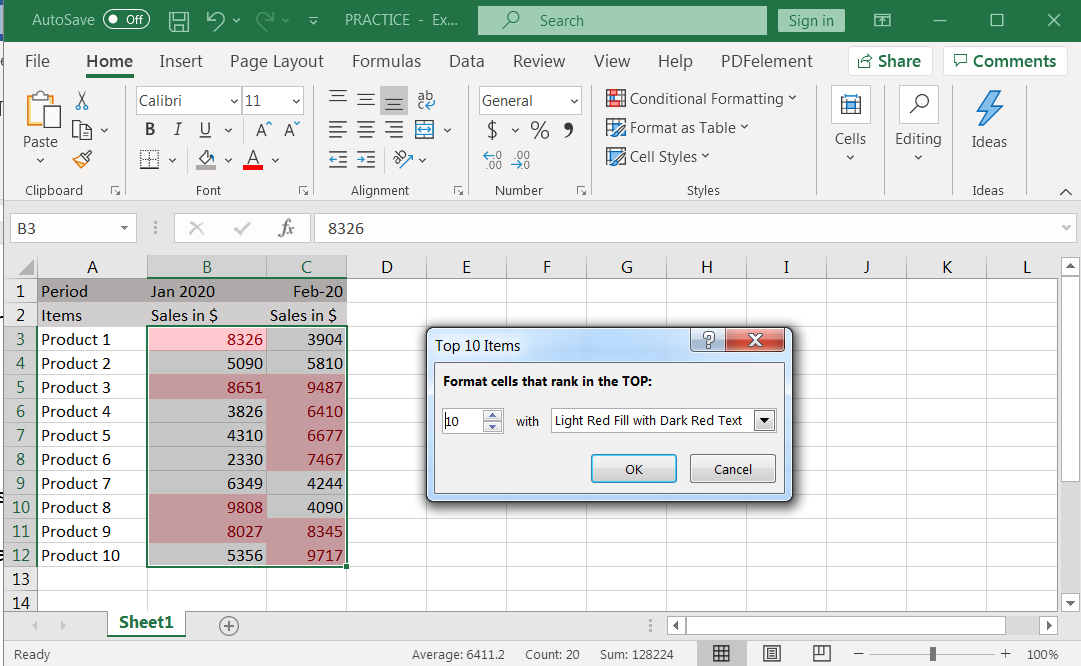
Click to “OK”
Top 10 items will be highlighted in “Light Red Fill with Dark Red Text”
We can simply use the above steps to make the conditional formatting to below remaining parameters:
-> Top/Bottom Rules
– Top 10%…
– Bottom 10 Items…
– Bottom 10 %…
– Above Average…
– Below Average…
We can also place conditional formatting basis on Data Bars presentation.
-> Gradient Fill : This shows the Data Bars in two shades
-> Solid Fill : This will show the Data Bars in one color
Follow below procedure:
Select the Sales values in Column B (in below example)
Click to Menu -> Conditional Formatting -> Data Bars -> Blue Gradient… (You can choose any of given color i.e. Green, Red, Orange, Light Blue and Purple)
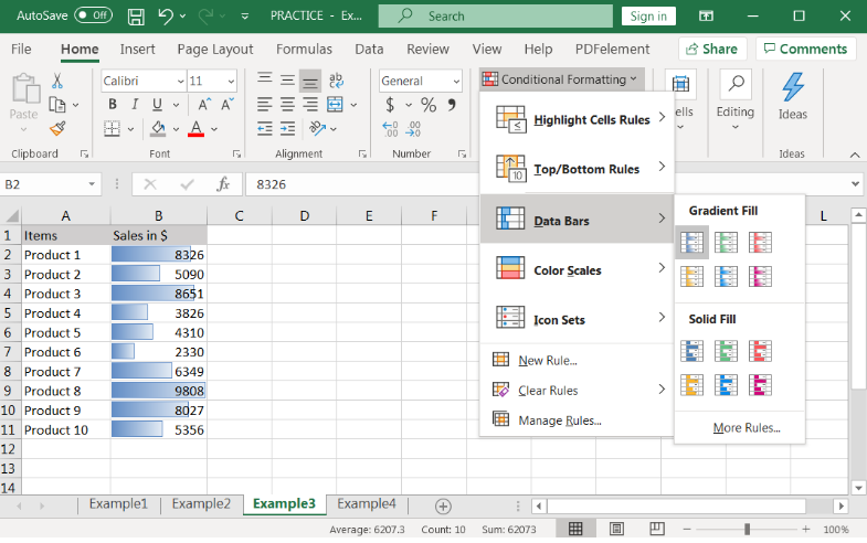
Click to “OK”
Sales volume will be presented in Data Bars format, higher values will have the larger bars and lowest values will have lower bars.
Example 4: Color Scales Rules
We can also place conditional formatting basis on Data Bars presentation. Follow below steps:
Select the Sales values in Column B (in below example)
Click to Menu -> Conditional Formatting -> Color Scales -> Green-Yellow-Red Color Scales… (You can choose any of given colors)
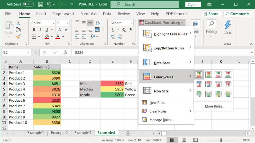
Click to “OK”
Sales volume will be presented in Color Scales format, higher values will have the larger bars and lowest values will have lower bars.
Explanation to Color Scales:
There are three colors available in Color Scales i.e. Red, Yellow and Green. Minimum value is colored as “RED”. Mid value is colored as “YELLOW” and Highest value is colored as “GREEN”. Rest other cells are colored as per the appropriate propositions.
Example 5: Icon Sets Rules
We can also place conditional formatting basis on Icon Sets presentation. Follow below steps:
Select the Sales values in Column B (in below example)
Click to Menu -> Conditional Formatting -> Icon Sets -> 3 Arrows (Colored) (You can choose any of given Icon Sets)
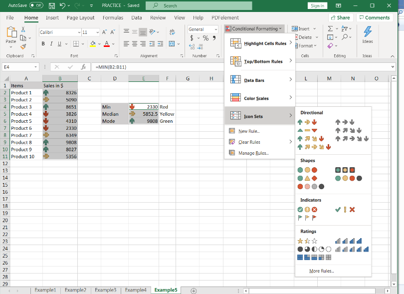
Click to “OK”
Sales volume will be presented in Icon Sets format, higher values will have the “UP” Sign/Arrow and lowest values will have “DOWN” Sign/Arrow.
Explanation to Icon Sets:
There are Icons available in Icon Sets i.e. DOWN, FLAT and UP Arrow. Minimum value is shown with “DOWN Arrow” (RED). Mid value is shown with “FLAT Arrow” (YELLOW) and Highest value is shown with “UP Arrow” (GREEN). Rest other cells are mentioned with Icon sets as per the appropriate propositions.
Example 6: Clear Rules
We can also “Clear Rules” of existing conditional formatting, which are available in the excel spreadsheet. “Clear Rules” will remove all the formatting placed in the highlighted area or from entire sheet. It is very useful and easy to apply, and all formatting can be removed in one go. Follow the below procedure to apply “Clear Rules:
Select the Sales values in Column B (in below example)
Click to Menu -> Conditional Formatting -> Clear Rules ->
-> Clear Rules from Selected Cells
-> Clear Rules from Entire Sheet
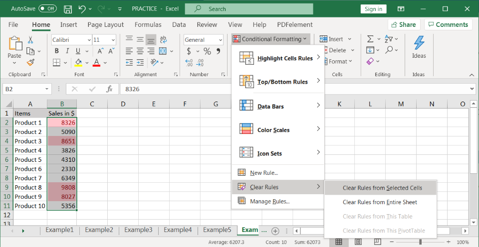
All existing Rules in the Selected Cells will be removed. We can also remove the rules for entire worksheet by clicking “->Clear Rules from Entire Sheet” option.
Example 7: Manage Rules
If we need to edit the existing Rules available in the excel sheet, we can edit them with the help of “Manage Rules”. Follow the below steps:
Select the Sales values in Column B (in below example)
Click to Menu -> Conditional Formatting -> Manage Rules ->
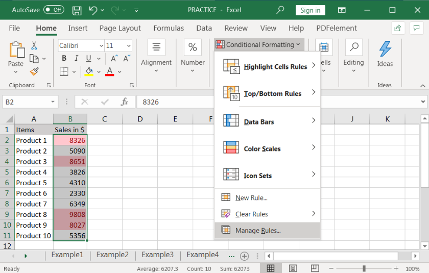
Click to “Edit Rules”
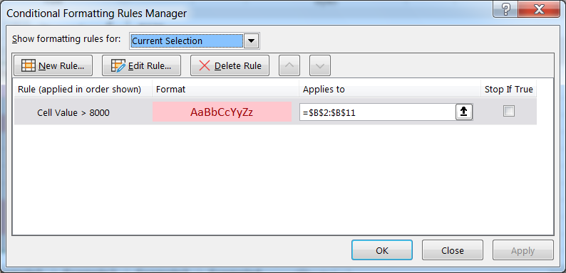
Edit Rules as per the requirements ->
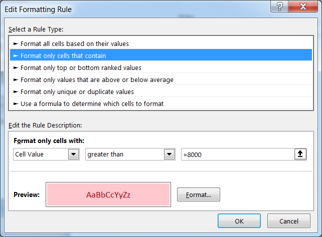
Click to “OK”
Hope you liked. Happy Learning.
Don’t forget to leave your valuable comments!
How to find duplicates in excel? Hope you read the post “Remove Duplicates in Excel”. Now I am going to explain how you can find these duplicates. There are multiple methods available to Find and…

Scroll Lock in Excel can make scrolling, selecting cells, checking formulas, entering data, and recording macros harder. So, you might need to turn it off to work normally. In this article, we’ll show you how…

FIND function is used to find the position of text, or character in an available string.

Learn an easy way to add pictures directly into a cell using the new IMAGE function! For a long time, adding pictures to Excel was tricky and time-consuming. But now, with the IMAGE function, you…

Calculate Percentage in Excel Calculate Percentage in Excel :-The term “per cent” comes from the Latin per centum, meaning “by the hundred.” A percentage is a way to show a part of something out of…

How to use Excel Function PROPER? PROPER function is used for changing the format of any text or string to PROPER or SENTENCE Case. PROPER Function has argument only one argument i.e. text, which makes the function…