Pareto principle was introduced by Italian Economist Vilfredo Pareto. He stated that 80% of the effects are caused by 20% of the causes. So if we closely monitor and solve 20% of the causes. It will significantly improves the affected area and you will see good results.
For Example: 80% of the revenue gets generated by 20% of the clients
While doing research Mr. Pareto found that 20% of land in Italy was occupied by 80% of the population. He carried out this survey to other areas and got same results
This rule is also well known as 80/20 rule across the globe and is mostly being used to find the causes which is impacting business or producing defective products/services
Hence Pareto chart is a graphical representation of Pareto Principle
Pareto Chart studies the frequency distribution and advise you the most impacted/affected areas. So you should use Pareto Chart when:
Here are few steps to collect data before you start preparing your Pareto Chart in Excel:
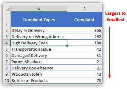
Here I collated the Complaints data from one of the Courier Company survey and will create Pareto Chart for them. Lets follow the steps now:
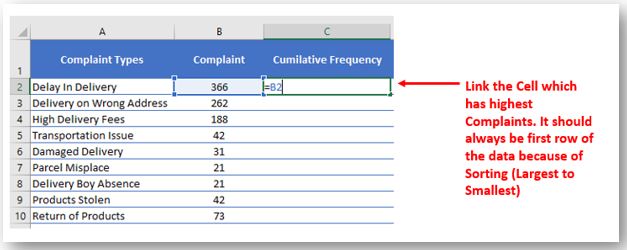
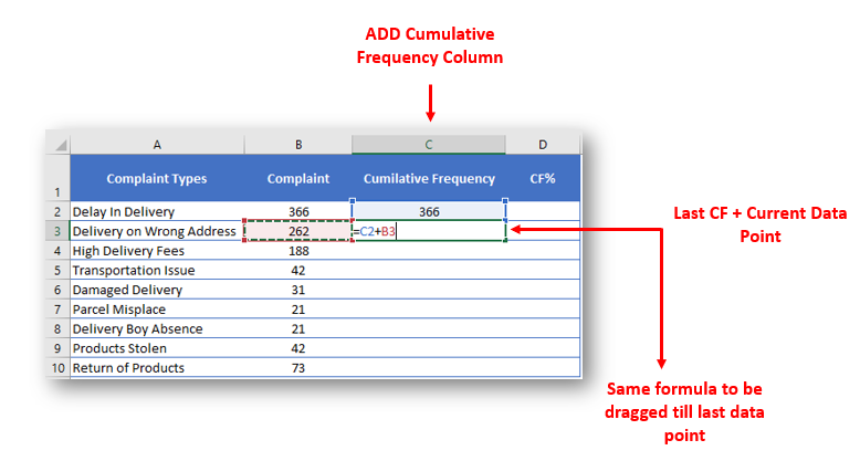
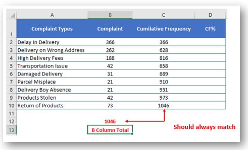
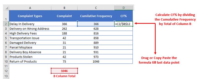
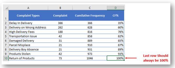
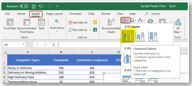
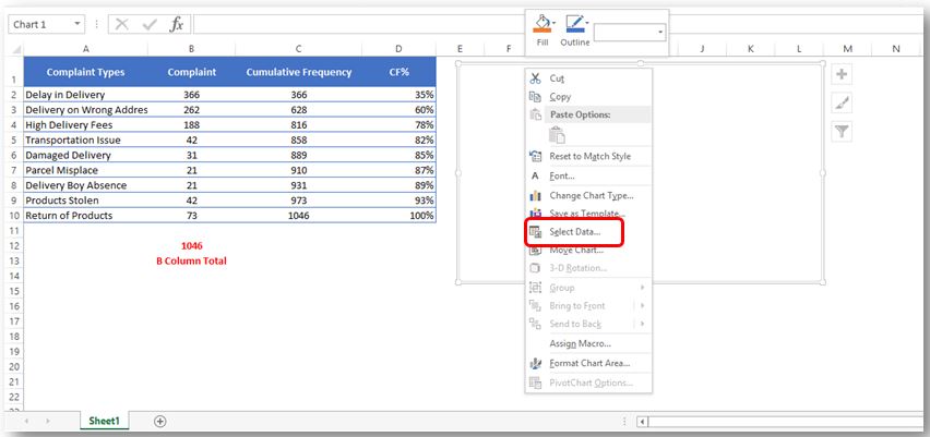
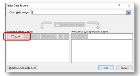
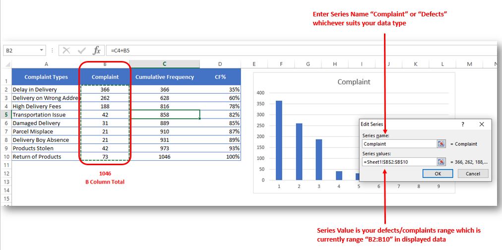
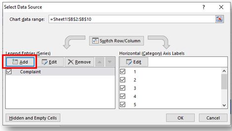
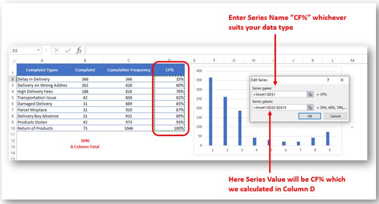
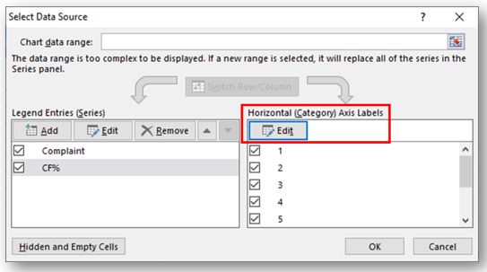
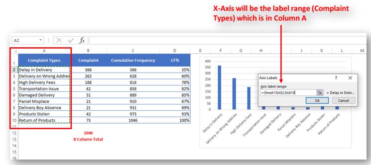
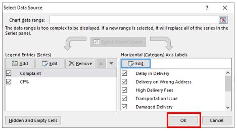
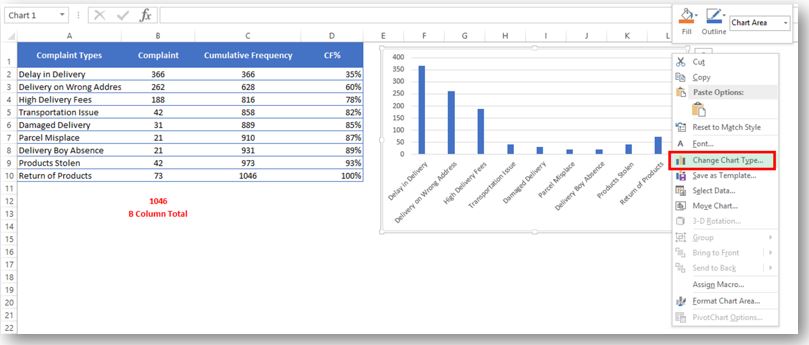
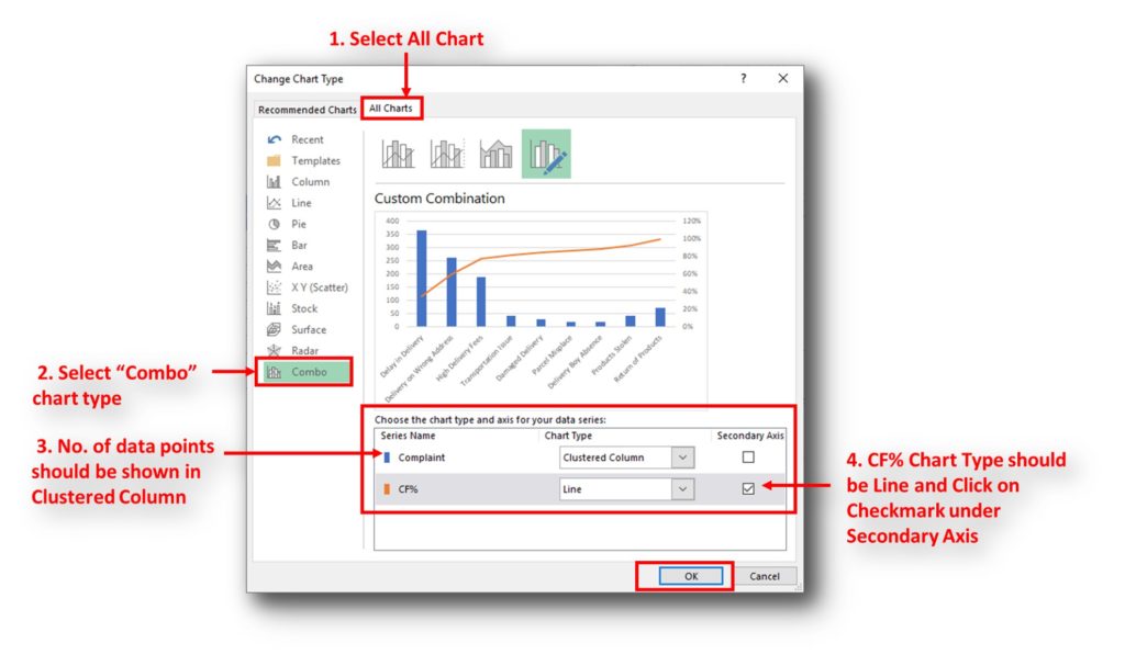
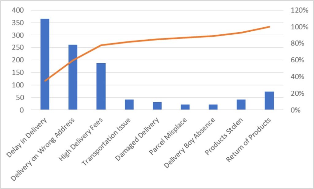
So here your Pareto chart is ready. This will help you to showcase the major pain areas or impacted areas in visual display
Now if you want to make this chart more appealing and visual. Then you can do this by learning tricks about formatting charts.
Hope you liked this article. Please comment below for any questions and for your feedback about this tutorial.
Follow us by Subscribe Us option for new updates

How to Compare TWO Columns in Excel? Comparing Columns in Microsoft excel is much often feature that is used while managing database. We have many ways to compare the columns in excel and can be…

This guide shows three easy ways to make a histogram in Excel: using the built-in Histogram tool, formulas, or a PivotTable. Even though making charts is usually simple, histograms can be tricky. But in newer versions of Excel, it’s easy to create one in just a few steps. Let’s explore each method in detail.

Introduction Calculate Percentage in Excel :-The term “per cent” comes from the Latin per centum, meaning “by the hundred.” A percentage is a way to show a part of something out of 100. You can…

Discover free videos and tutorials to master Excel formulas and functions. Practice directly in our Online Excel Practice Files without downloading anything. Have questions? Drop them in the comments. Let’s begin! Basic Excel Formulas and…

Delta Symbol in Excel The Greek Capital Alphabet letter Delta (▲) and is commonly discussed topic in Excel. This is being used for various purposes i.e. changes in quantity, insert the symbol in excel etc….
How to Get RGB Codes of a Color? Excel supports more than 16 million colors in a cell; hence you should know how to set the exact color in a cell. To do this through…

How to Compare TWO Columns in Excel? Comparing Columns in Microsoft excel is much often feature that is used while managing database. We have many ways to compare the columns in excel and can be…

This guide shows three easy ways to make a histogram in Excel: using the built-in Histogram tool, formulas, or a PivotTable. Even though making charts is usually simple, histograms can be tricky. But in newer versions of Excel, it’s easy to create one in just a few steps. Let’s explore each method in detail.

Introduction Calculate Percentage in Excel :-The term “per cent” comes from the Latin per centum, meaning “by the hundred.” A percentage is a way to show a part of something out of 100. You can…

Discover free videos and tutorials to master Excel formulas and functions. Practice directly in our Online Excel Practice Files without downloading anything. Have questions? Drop them in the comments. Let’s begin! Basic Excel Formulas and…

Delta Symbol in Excel The Greek Capital Alphabet letter Delta (▲) and is commonly discussed topic in Excel. This is being used for various purposes i.e. changes in quantity, insert the symbol in excel etc….

How to Get RGB Codes of a Color? Excel supports more than 16 million colors in a cell; hence you should know how to set the exact color in a cell. To do this through…

How to Compare TWO Columns in Excel? Comparing Columns in Microsoft excel is much often feature that is used while managing database. We have many ways to compare the columns in excel and can be…

This guide shows three easy ways to make a histogram in Excel: using the built-in Histogram tool, formulas, or a PivotTable. Even though making charts is usually simple, histograms can be tricky. But in newer versions of Excel, it’s easy to create one in just a few steps. Let’s explore each method in detail.

Introduction Calculate Percentage in Excel :-The term “per cent” comes from the Latin per centum, meaning “by the hundred.” A percentage is a way to show a part of something out of 100. You can…

Discover free videos and tutorials to master Excel formulas and functions. Practice directly in our Online Excel Practice Files without downloading anything. Have questions? Drop them in the comments. Let’s begin! Basic Excel Formulas and…

Delta Symbol in Excel The Greek Capital Alphabet letter Delta (▲) and is commonly discussed topic in Excel. This is being used for various purposes i.e. changes in quantity, insert the symbol in excel etc….

How to Get RGB Codes of a Color? Excel supports more than 16 million colors in a cell; hence you should know how to set the exact color in a cell. To do this through…
I really liked this article. Well drafted. Thanks for the help